User Experience
I was employed by EdTech entrepreneur Alastair Price to rebrand iSAMS. Alastair’s mission was always a simple one — to create the leading web-based management information system (MIS) for schools worldwide. Here’s a breakdown of my rationale for restyling the company’s main product.
User Interface
The best products make life easier by integrating form, function, value and performance. At the heart of iSAMS is the MIS. Shortly after graduating, Alastair wrote the initial code in his bedroom. 20 years later, the MIS was used by 2,000 schools in over 90 different countries.
However, when I joined iSAMS, the user interface looked like Windows XP and potential clients were asking if the back-end was also outdated. Thankfully, that wasn’t the case and I worked closely with Alastair to modernise his product. Together we created a new framework, an updated login UI, a new dashboard and a full range of bespoke icons.
Initial feedback was great and the update provided a solid foundation for continued growth.
Login UI
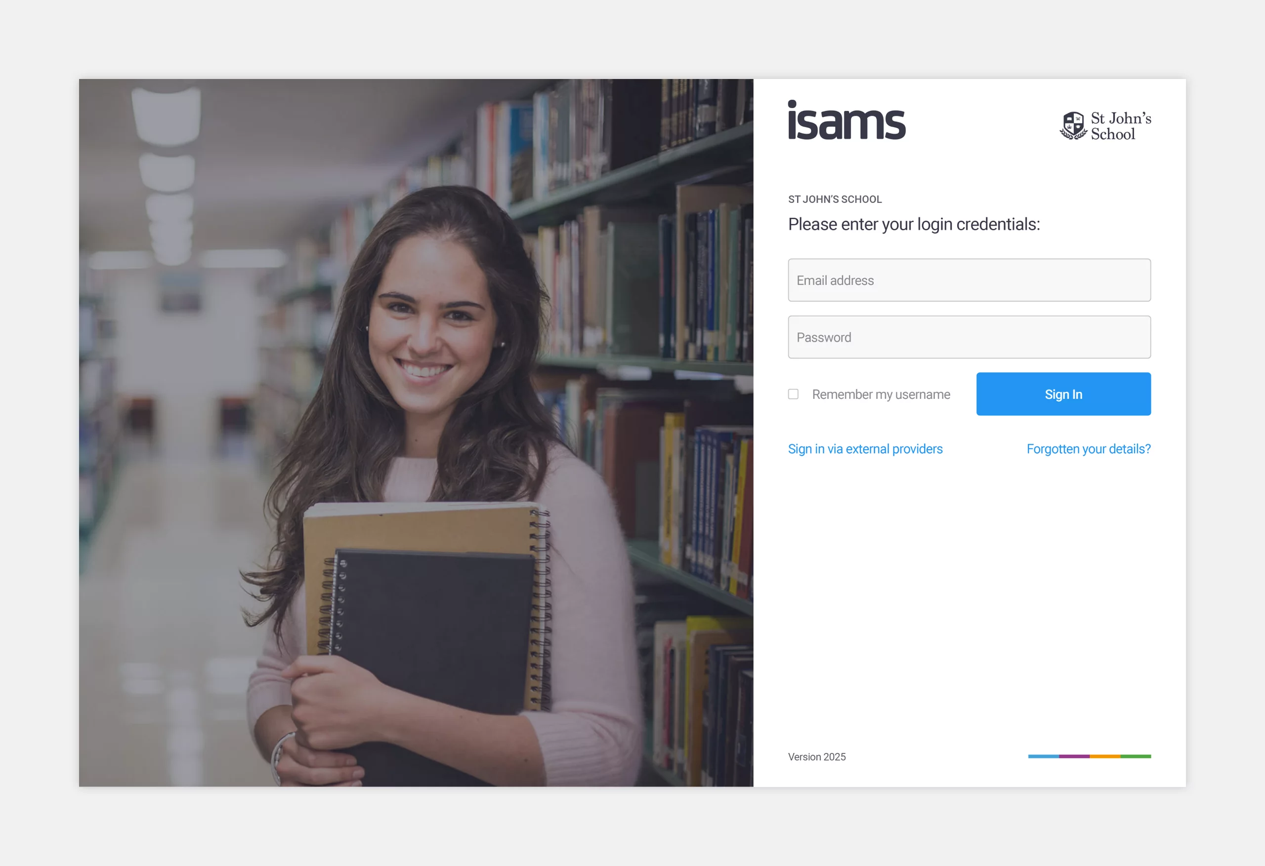
The biggest requirement for the updated login UI was the ability for schools to upload their own logo and background image. From a development point of view, the login needed to cater for single sign-on, and from a visual point of view, I needed to make sure all states, alerts, error messages, links and enhanced security settings were considered.
Dashboard
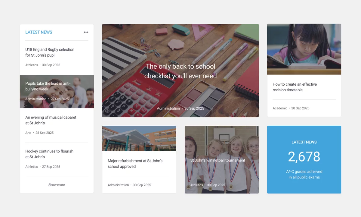
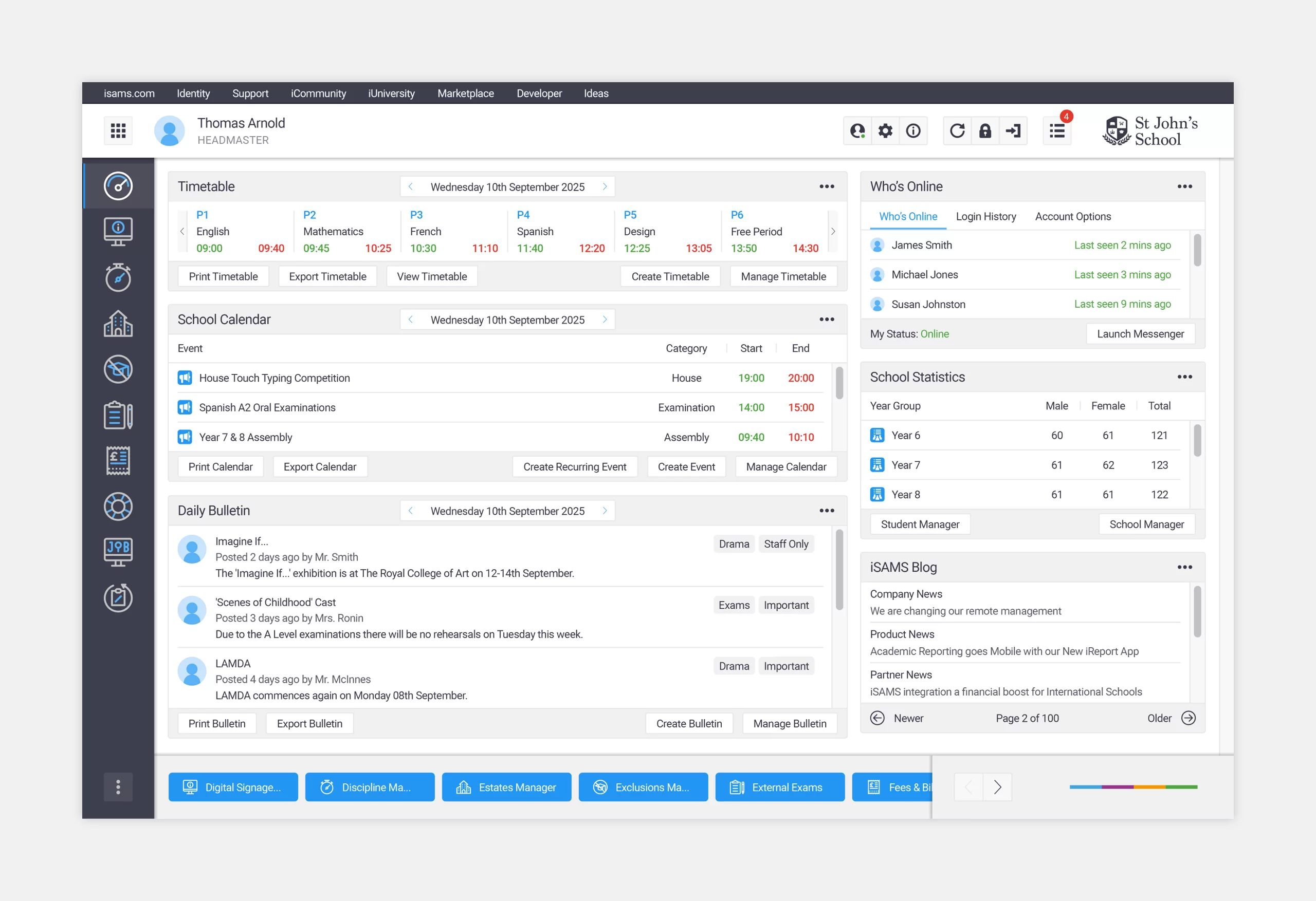
Before the framework redesign, the MIS didn’t have a dashboard. Alastair and I focused on creating widgets that maximised the available real estate, without making the product feel cluttered. I also created a second colour palette to make the UI more vibrant.
The framework was designed using an 8px grid system. Customers were given the ability to expand or delete each widget, which could be relocated through drag and drop functionality. Schools could also create their own widgets.
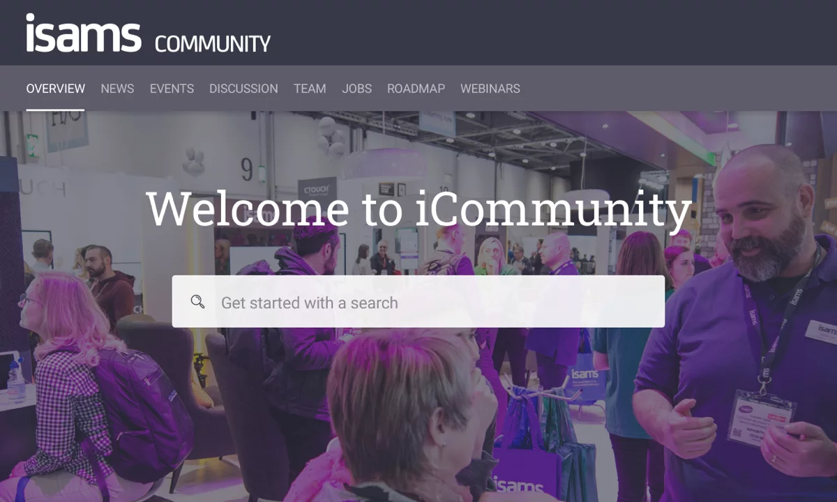
The white horizontal bar at the top was named the user bar. It allowed customers to change their status, preferences and settings. It also acted as a gateway to product updates, documentation, development resources, the community forum and e-learning zone.
The dark grey vertical bar on the left-hand side was the favourites bar. This displayed icons for key modules, which could also be reordered through drag and drop functionality.
The light grey horizontal bar at the bottom was called the module bar. It displayed modules in the form of buttons. These buttons allowed customers to quickly move between active modules.
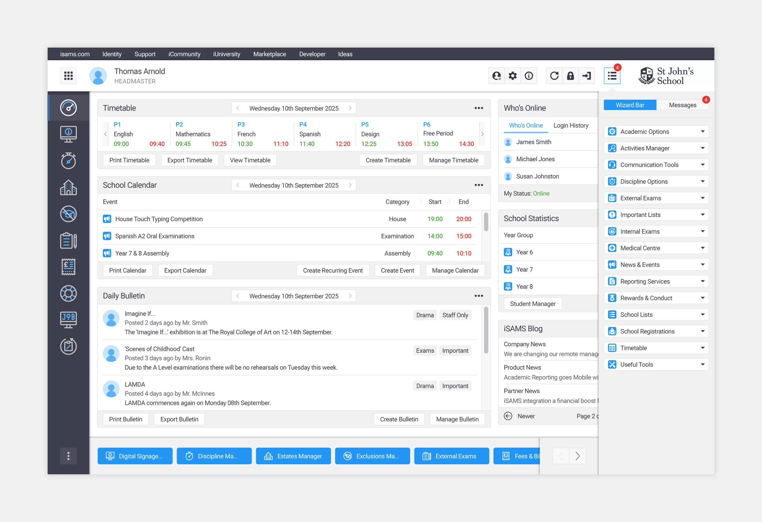
Wizard Bar
The wizard bar could be made visible via the user bar. It displayed quick links to actions within specific modules. Each category had its own set of icons for both parent and child links. The icons were completely bespoke and used a 16px grid.
Module Overview
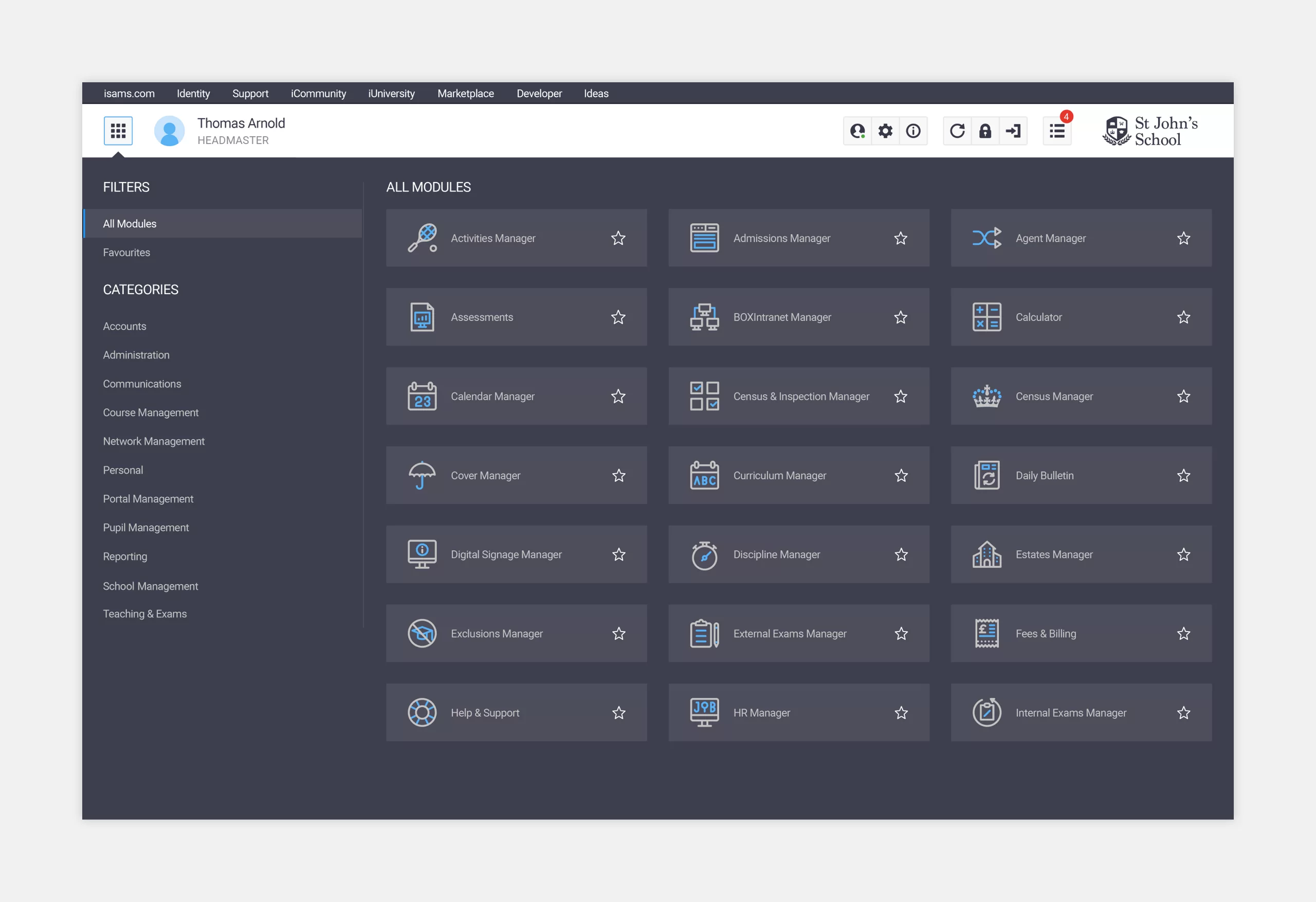
The module overview could be made visible via the user bar. It displayed all modules, broken down into useful categories. This was also where customers could select their favourite modules by clicking on the star icon. Before the framework redesign, there was no way of viewing all modules in a single interface, so this section proved very popular. All icons were bespoke and used a 32px grid.
