NextGen Portals
I was employed by EdTech entrepreneur Alastair Price to rebrand iSAMS. Alastair’s mission was always a simple one — to create the leading web-based management information system (MIS) for schools worldwide. Here’s a breakdown of my rationale for redesigning the range of portals.
UI Kit
Each school that selected iSAMS as its MIS was given access to a range of free portals, which pushed data to parents and students. This data could range from announcements, to notifications, to tasks, to actions, to daily feeds, to admissions, to content from key modules such as timetabling, exam results and school reports.
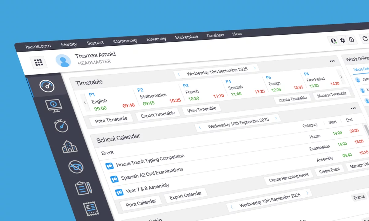
Like the MIS, the range of portals looked outdated. Also, they didn’t offer a responsive solution, so they couldn’t be viewed on mobile devices with any realistic legibility.
Alastair found a pre-existing UI kit, which I heavily customised. The kit was built in Sketch and powered by a 5px grid system. Alastair wanted the portals to use the same fonts and colours as the MIS, while feeling like a separate product. He wanted padding and line-heights to be more generous. He also wanted to use off-the-shelf icons to save time.
Menu Solution
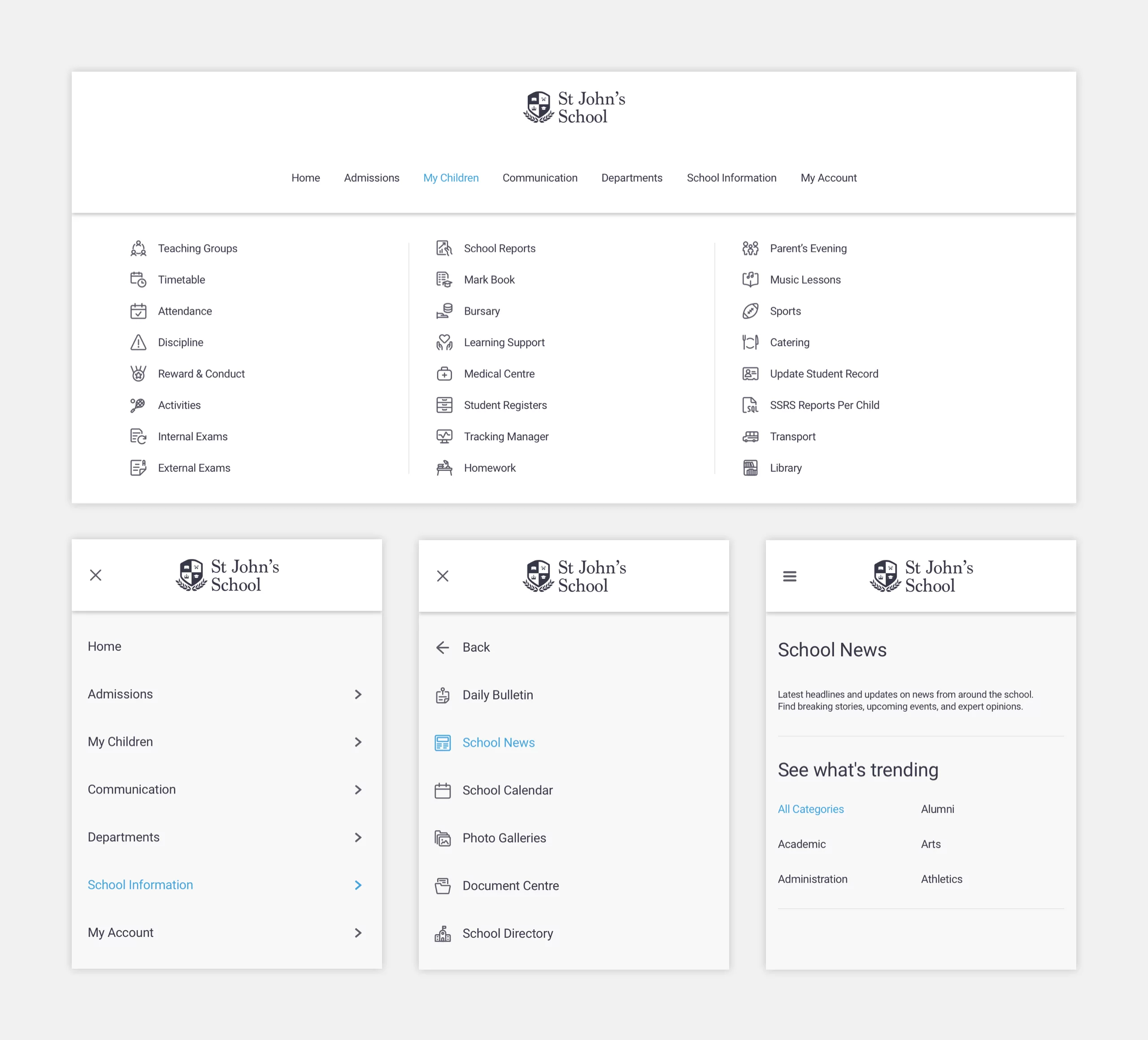
When activated, the desktop menu had smooth dropdown motion. The same motion was visible when you moved through the menu categories. The menu was designed to work in both light and dark mode, and a sequential format was the preferred option for the mobile experience.

Card System
One of the key portal requirements was an intuitive card system for displaying school news. Alastair asked me to create lots of possible scenarios at various widths. He also wanted these cards to be visually-driven, so I sourced decent stock photography and created realistic data based on certain flagship schools.


