New Logo
I was employed by EdTech entrepreneur Alastair Price to rebrand iSAMS. Alastair’s mission was always a simple one — to create the leading web-based management information system (MIS) for schools worldwide. Here’s a glimpse at some of the considerations I made while designing a new logo.
Audit
The rebranding process demanded a combination of investigation, strategic thinking, confident design and rational project management. It also required patience, a passion for doing things right, and an ability to consider vast amounts of information.
I needed to better understand iSAMS from a customer’s point of view. To achieve this, I reviewed all marketing collateral, alongside sales and communication tools. I reviewed the competition and their identity within the EdTech marketplace. I also interviewed Alastair.
Personality
With the research stage complete, the following attributes were highlighted as the personality of iSAMS:
- Flexible
- Web-based
- Forward-thinking
- Progressive
- Experienced
- Dynamic
- Customer-focused
- International
The next challenge was to assign these attributes to the elements that make up the customer experience. The first consideration was a suitable typeface for the logo.
Typefaces
The budget for this rebrand didn’t allow for a custom font, so I looked at several foundries including UK-based Fontsmith. The great thing about Fontsmith was their ability to clearly define the personality of each typeface, which allowed me to select fonts that matched the attributes listed above.
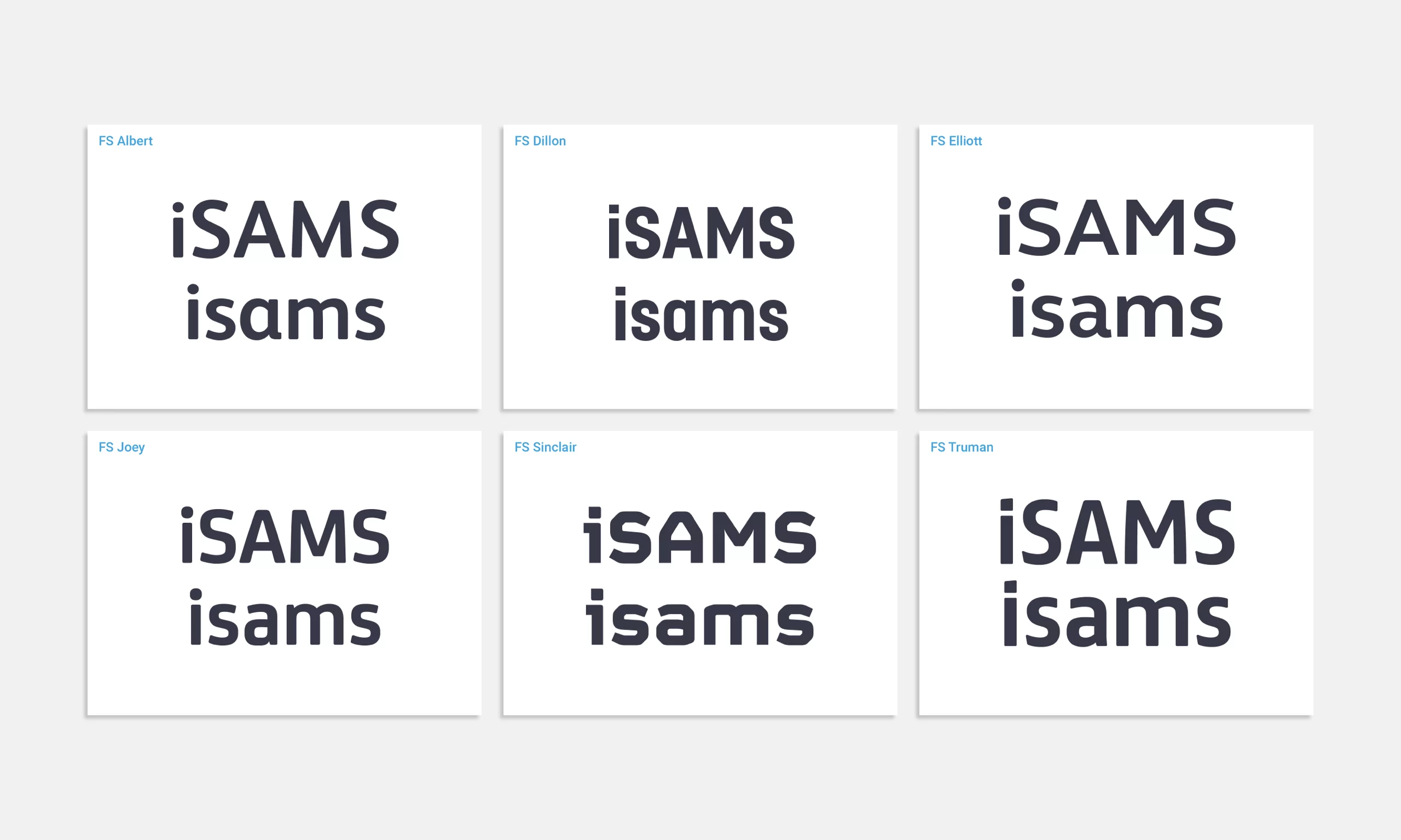
FS Joey
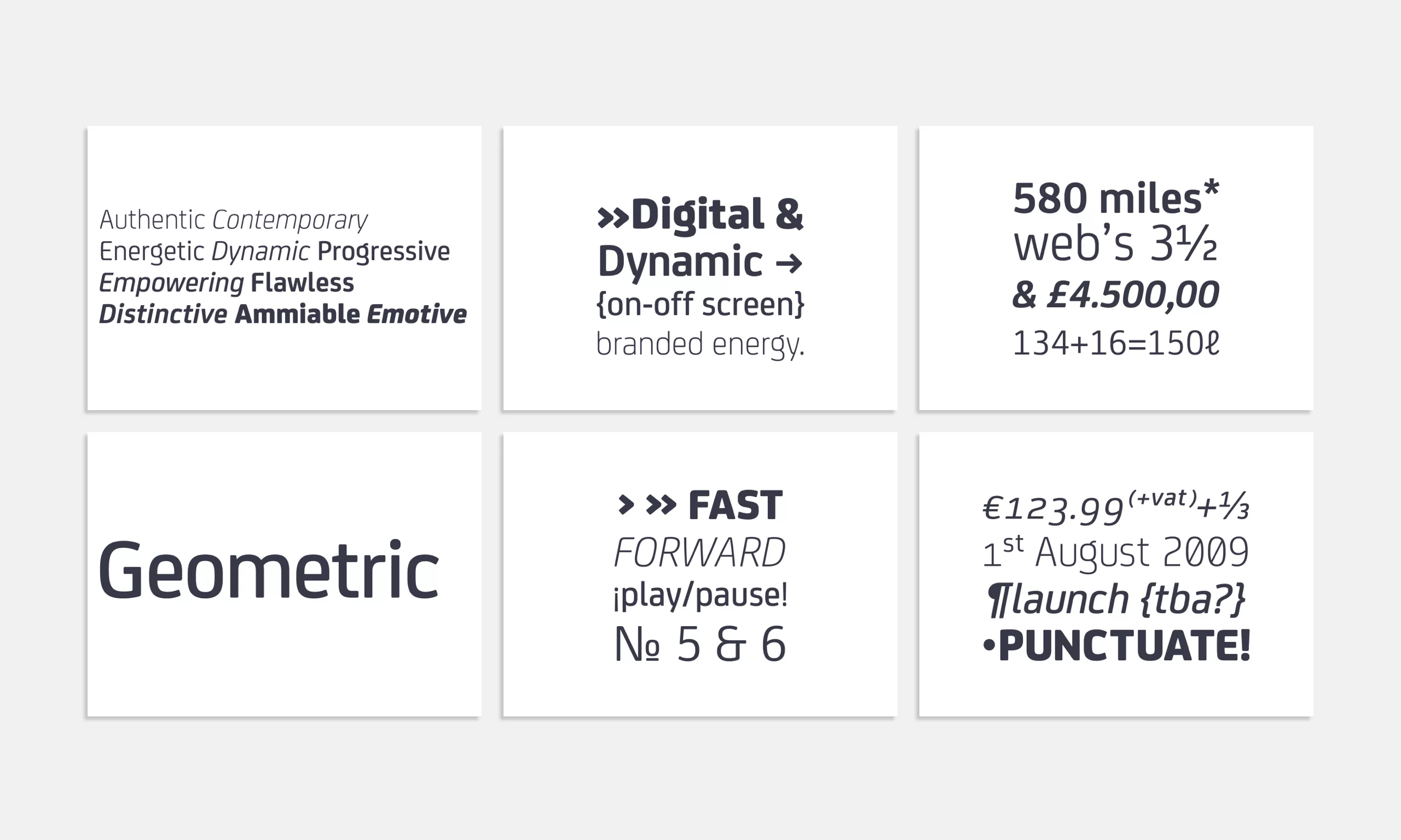
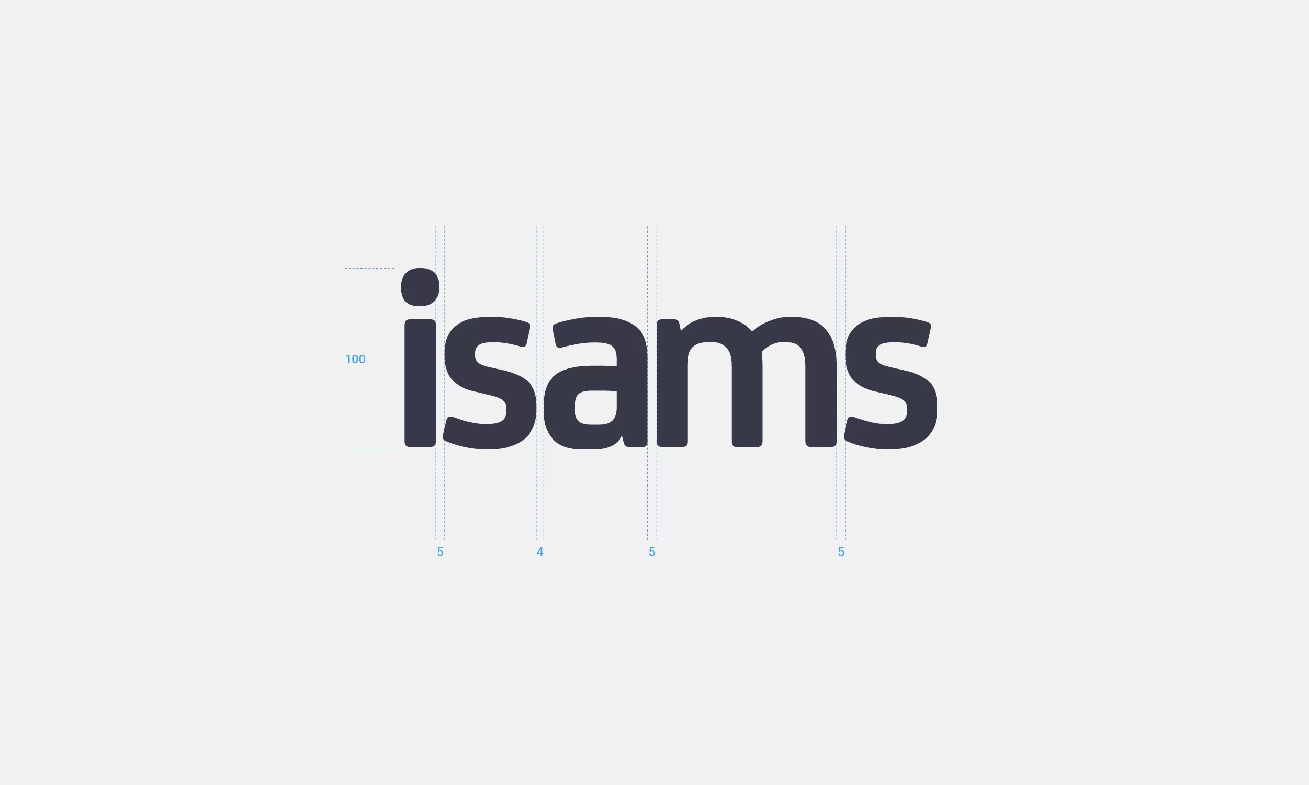
FS Joey was the chosen typeface. Originally conceived for an internet-based company, FS Joey was highly legible on-screen, especially when scale was compromised. FS Joey also had a good range of weights, which worked well in print. The font had a strong corporate character that was fresh, friendly, geometric and energetic. It was also a progressive typeface that helped promote continued growth.
Case Sensitivity
Lowercase or uppercase is a big question to answer when designing a logo. Lowercase creates an approachable brand personality that’s both credible and human-centric. Lowercase increases the friendliness of a company and its outward expression. Lowercase helps create an identity where the customer is the main focus. Uppercase feels inflexible, but it is official and traditional. After much consideration, we decided on lowercase.
Strapline
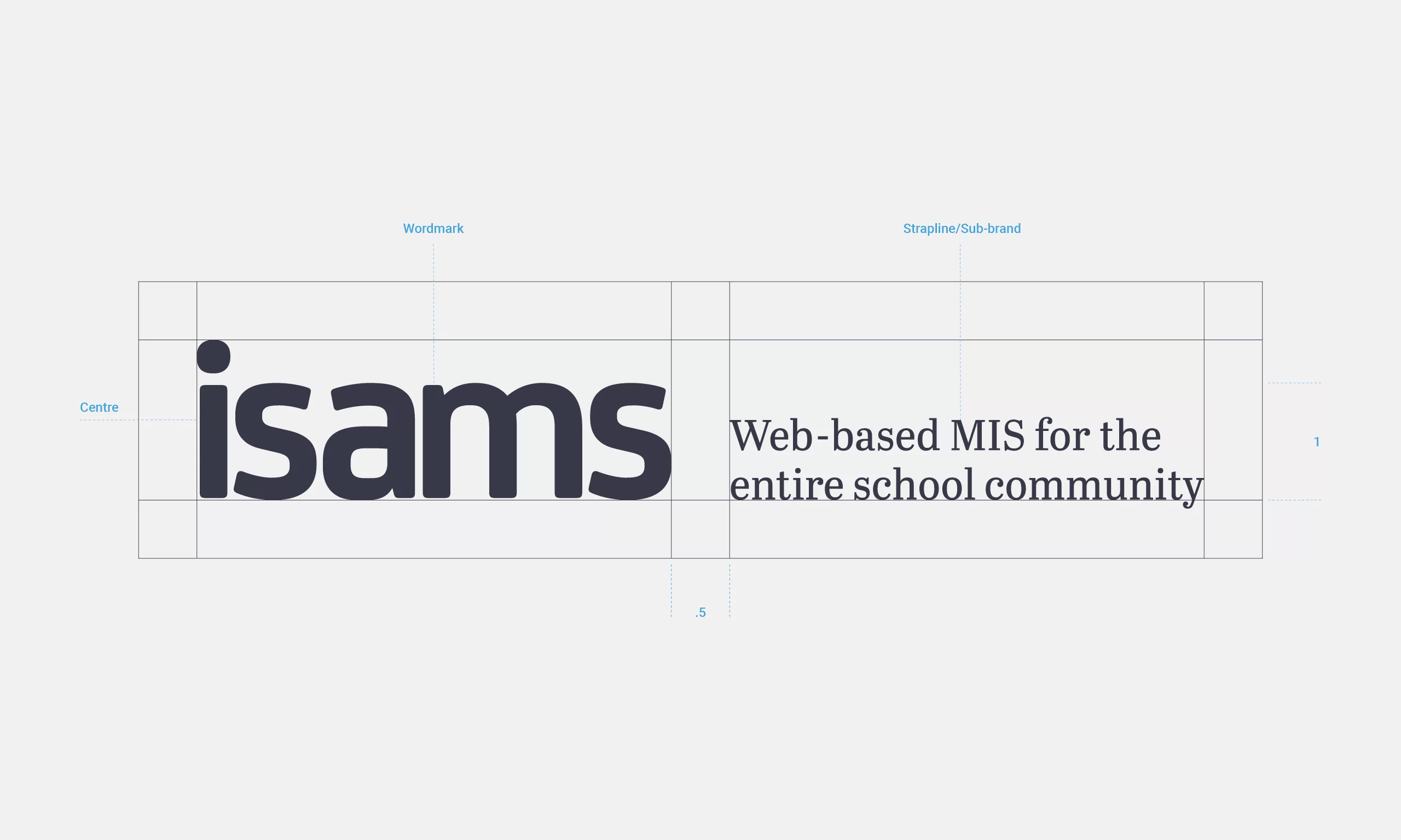
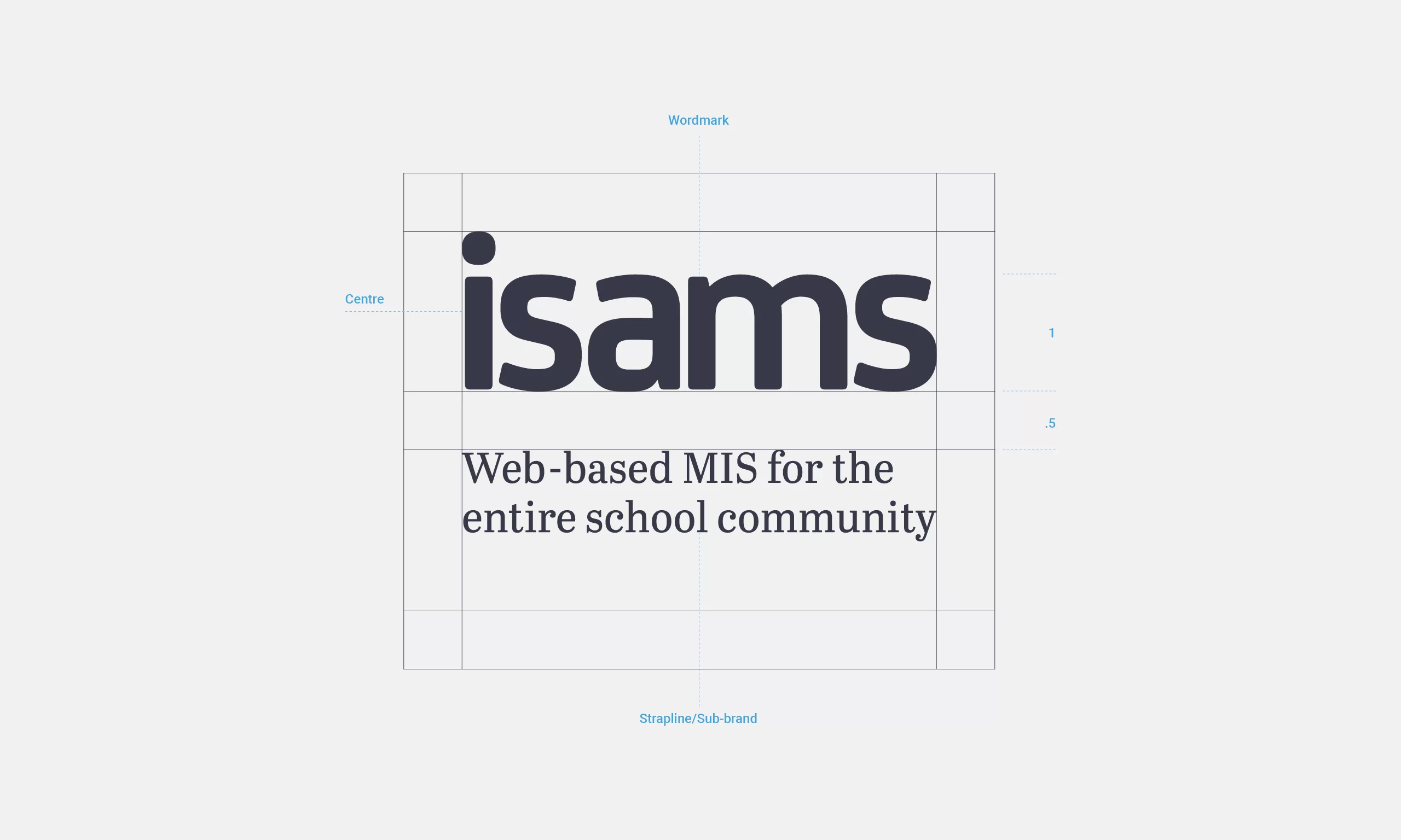
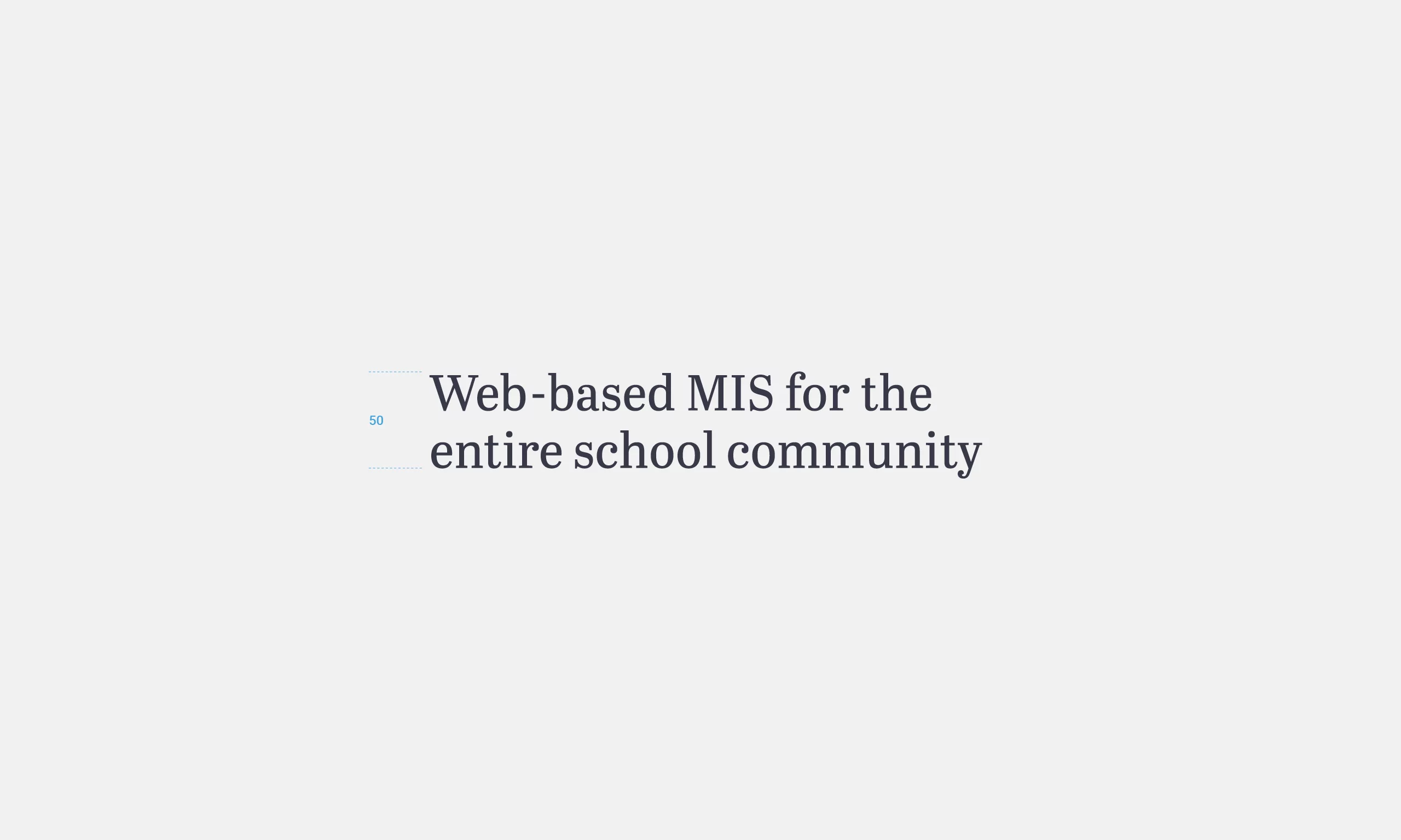
While interviewing Alastair, when describing iSAMS, he used the phrase ‘Web-based MIS for the entire school community’. This evoked an emotional response because it captured the essence of his business and it instantly became the company strapline.
The font was hand-picked by Alastair and we both liked its mechanical feel and large x-height.
Sub-brands
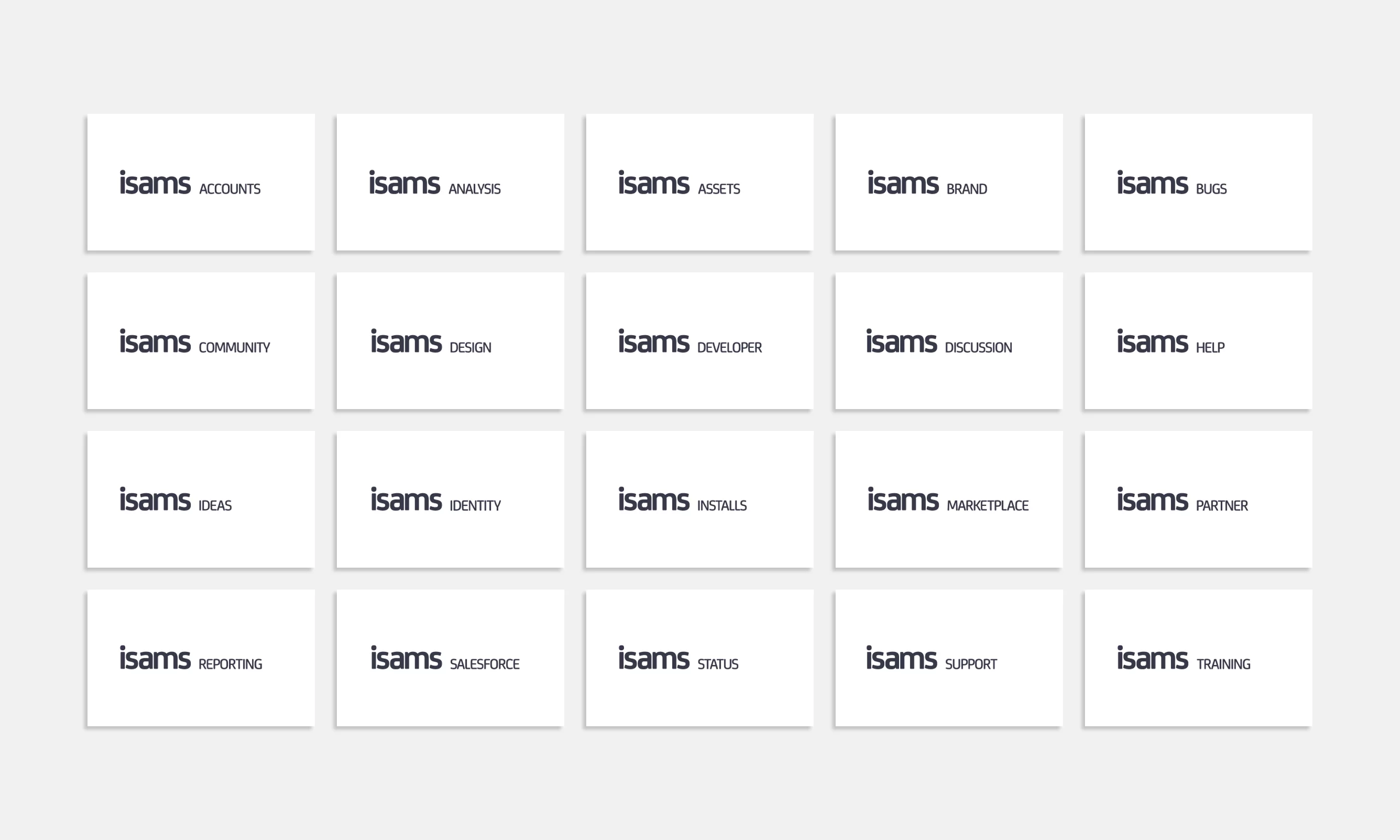
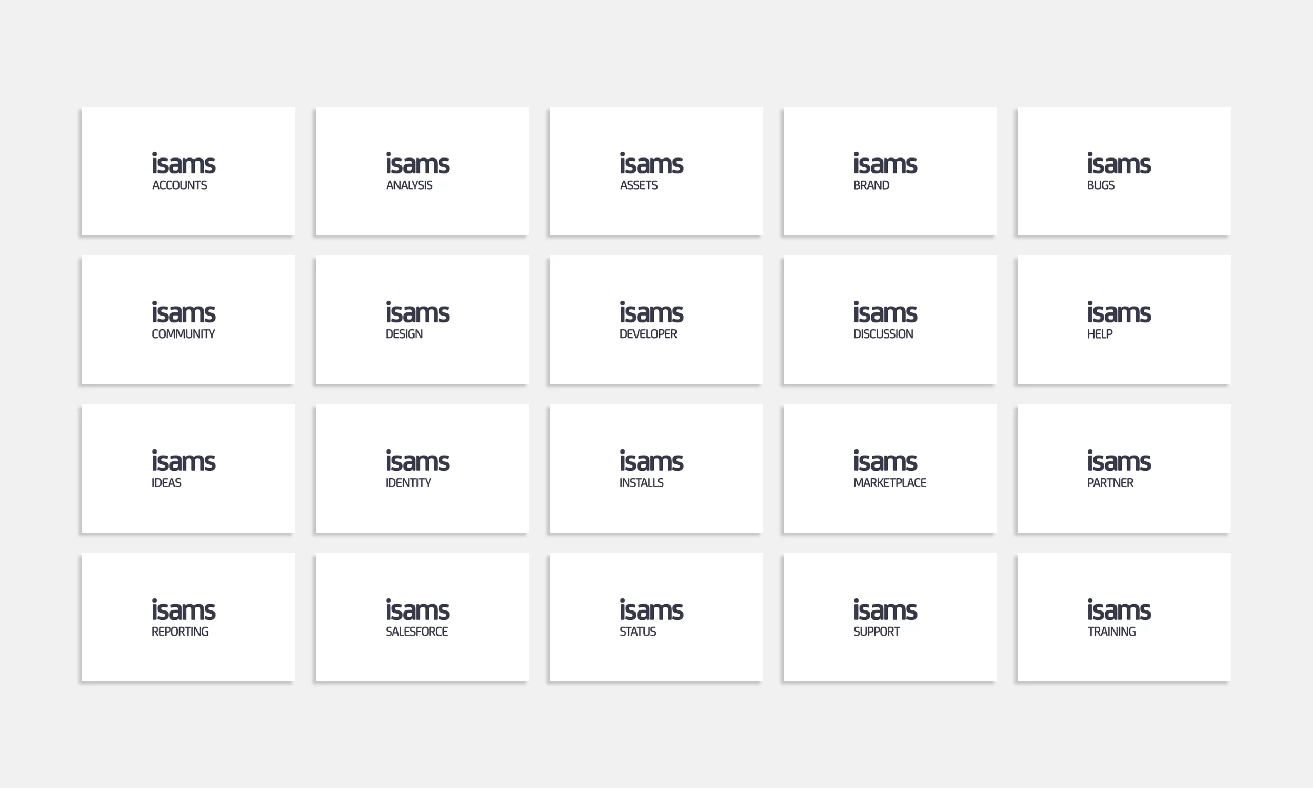
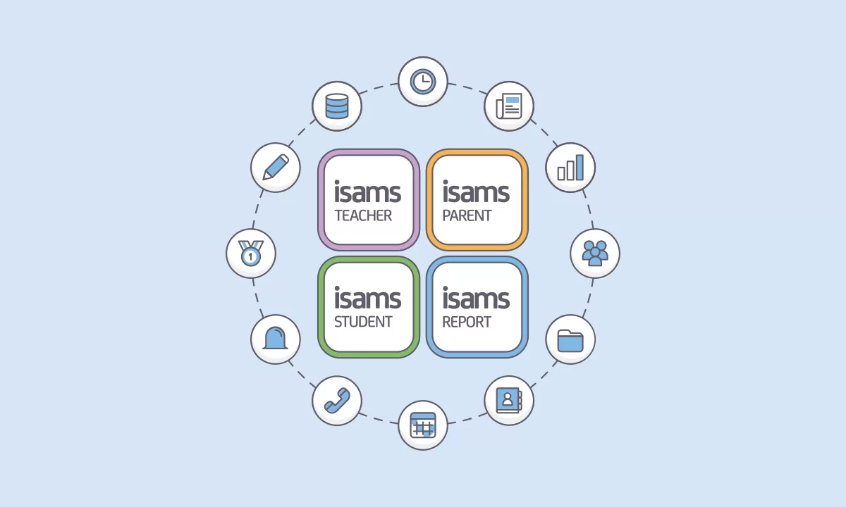
During the initial audit, we highlighted a need to reorganise the sub-brands. To accommodate this, I designed two flexible identity systems (landscape and portrait). Spacing was determined by the wordmark’s x-height, and the sub-brands were set in FS Joey Medium with tracking at -50.
