Additional Items
I was employed by EdTech entrepreneur Alastair Price to rebrand iSAMS. Alastair’s mission was always a simple one — to create the leading web-based management information system (MIS) for schools worldwide. Here’s a handful of additional items I created during the rebranding process.
Brand Guidelines
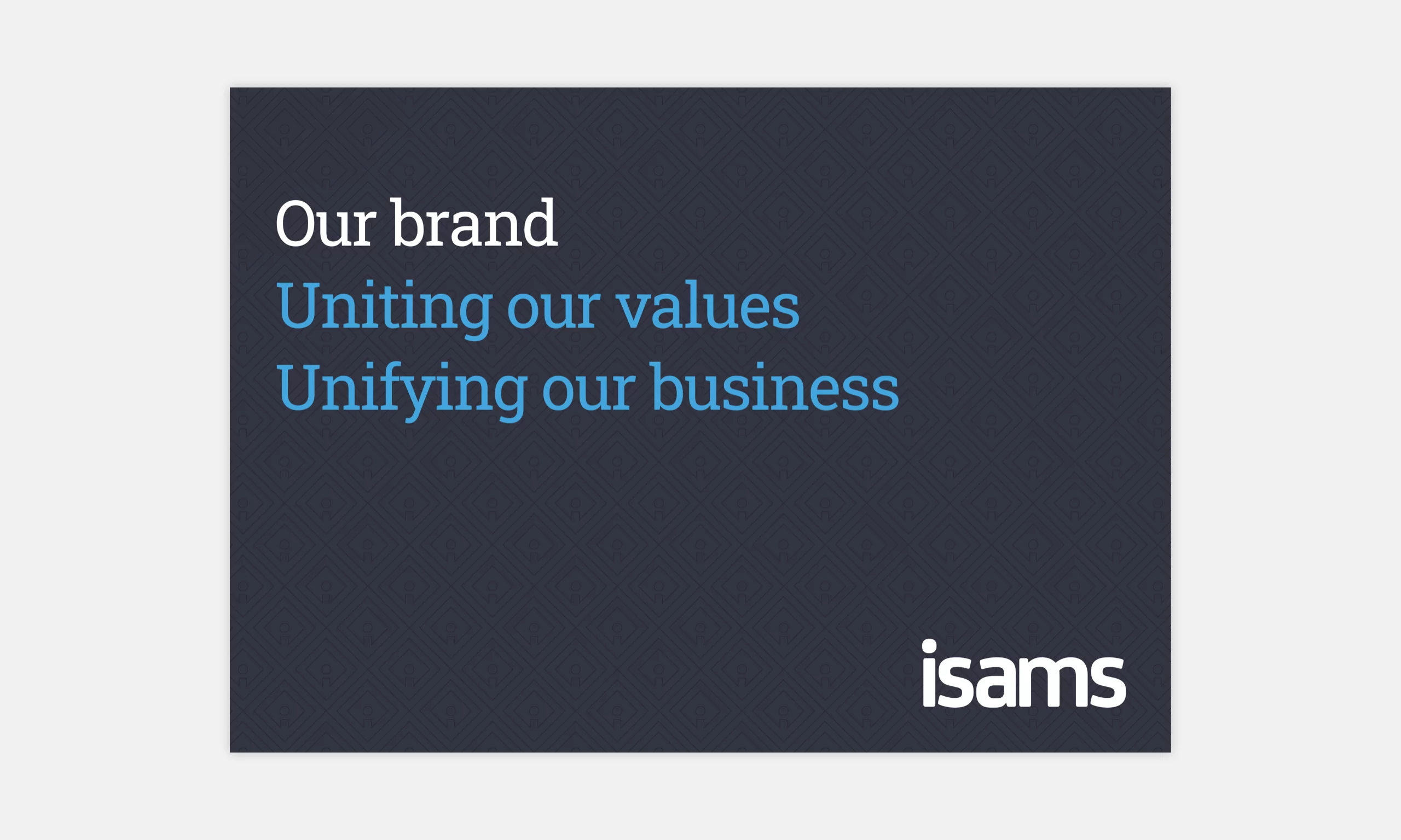
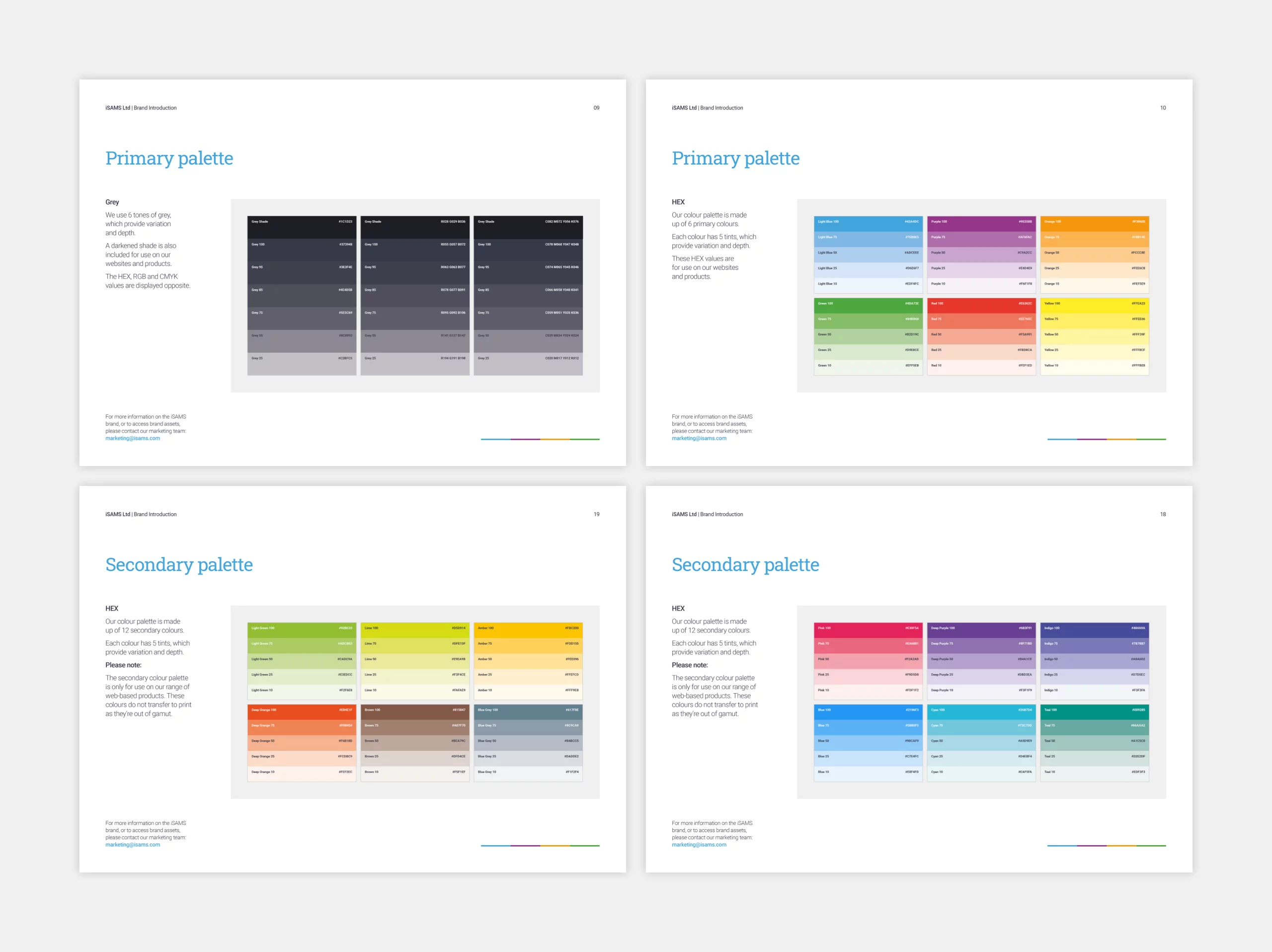
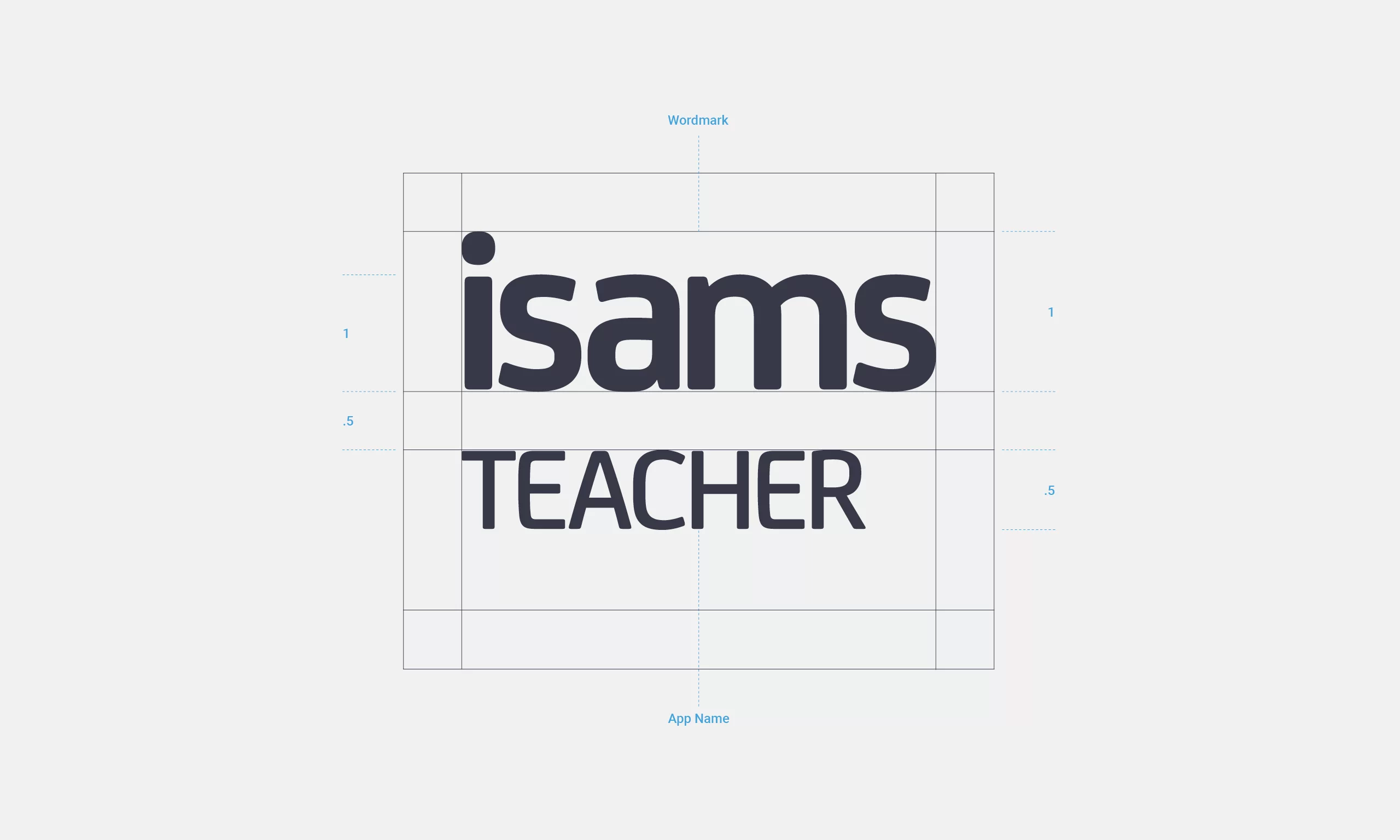
Managing the consistency and integrity of a brand is facilitated by intelligent guidelines that are easily accessible for internal staff and external stakeholders. Building a brand is the shared responsibility of every employee, and adhering to guidelines requires discipline and vigilance. Consequently, I created a comprehensive set of guidelines, which were available both as an online resource and a downloadable PDF.
Tile Pattern
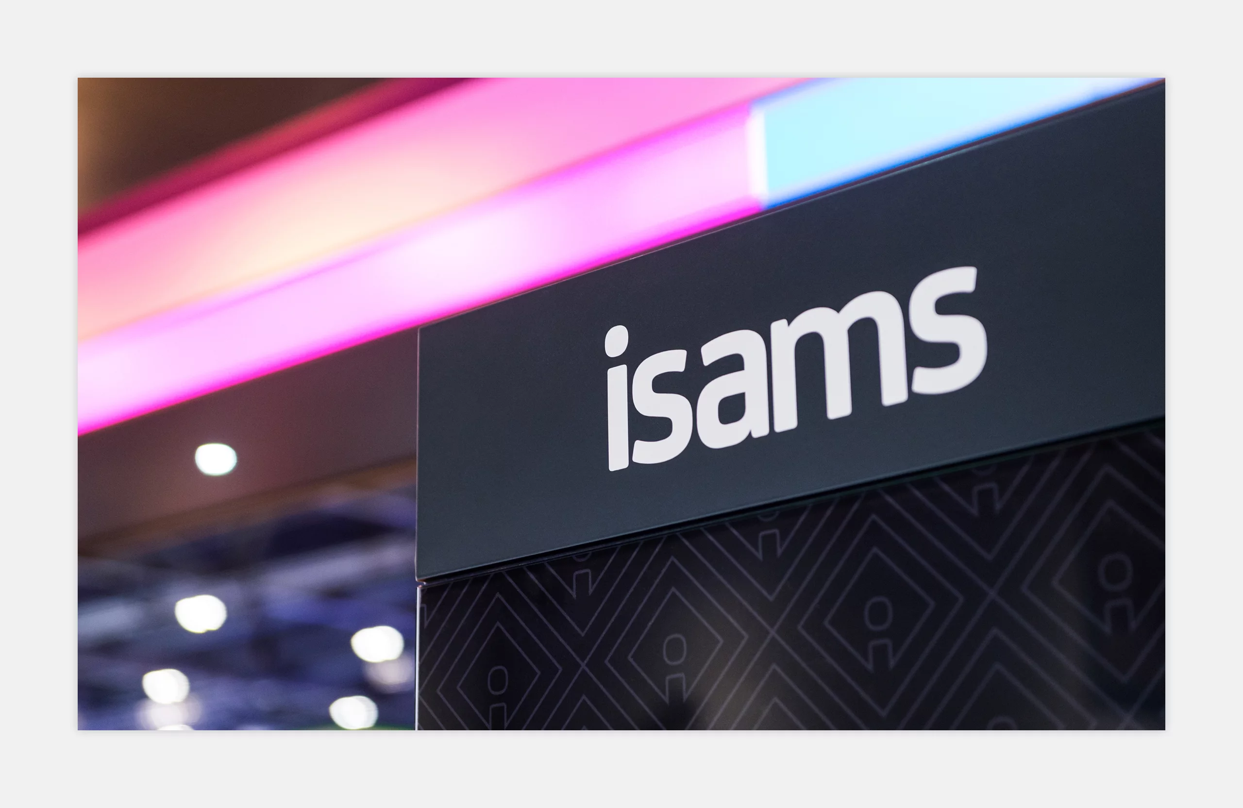
I created a bespoke tile pattern to add texture to grey backgrounds. The size of the tile was determined by taking the shortest dimension of the background surface (height or width) and dividing it by 8. The tile pattern was always positioned centrally.

App Icons
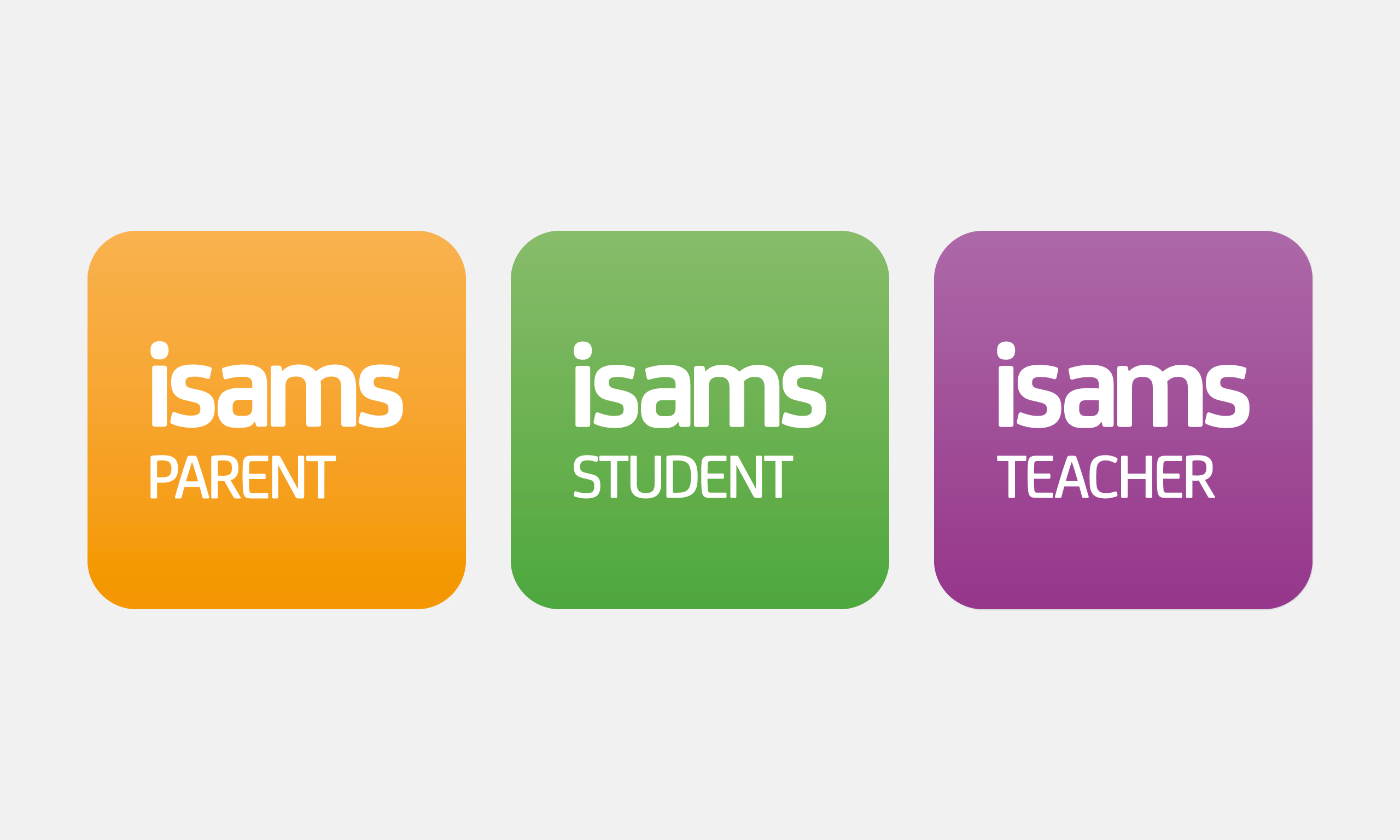
I used colour gradients to separate the apps. The gradients were made up of 100% and 75% tints of the relevant primary colour. The gradient was turned 90 degrees counter clockwise, so the darker tint was at the bottom.
Favicons
I designed a favicon to be used across all products and websites. A basic guide was created, so employees knew which colour to use.
The typeface from the new logo had an interestingly shaped dot on the letter ‘i’ and this informed the design.
This vector graphic became the company’s brandmark and was used on various documentation and merchandise.

Partner Badges
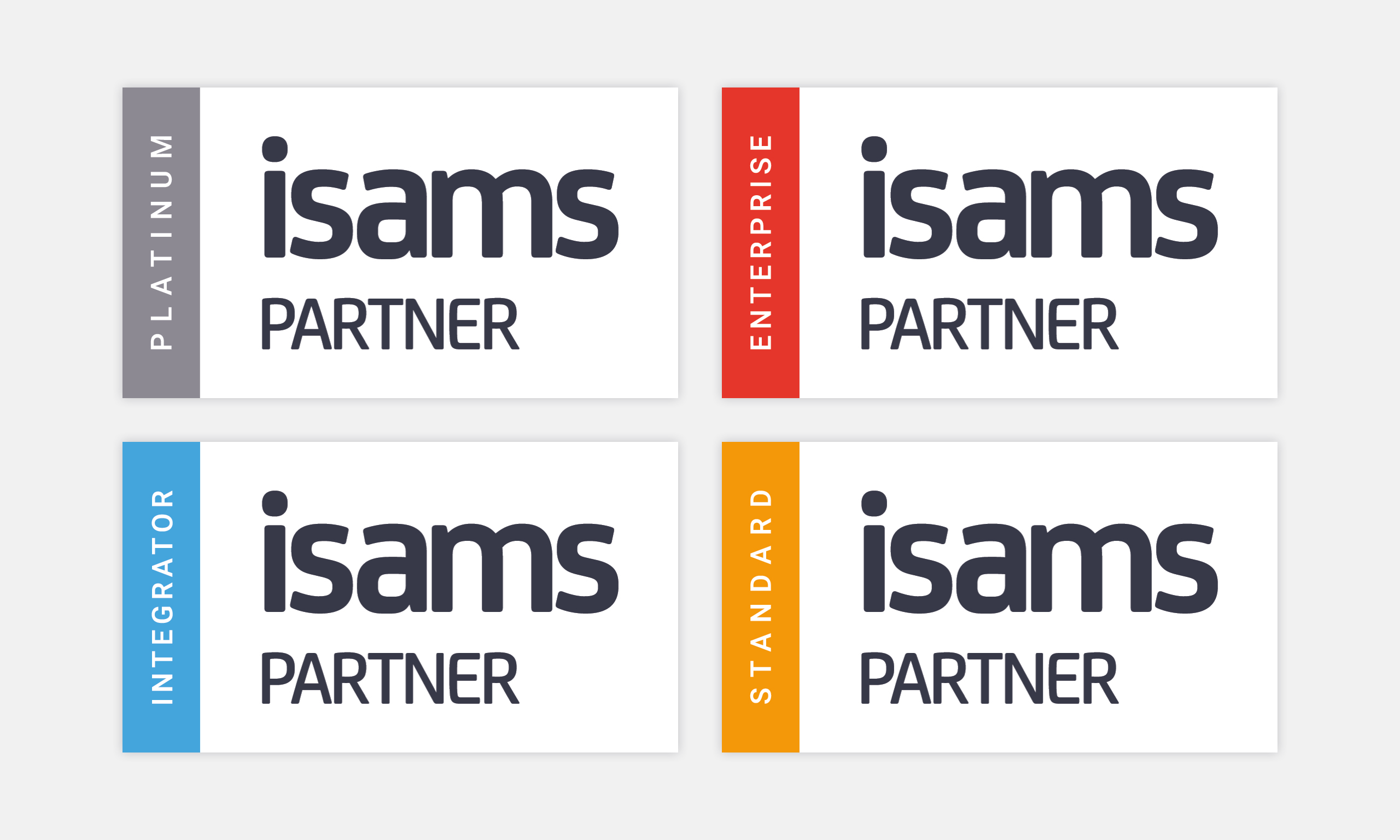
The iSAMS partner badge was granted to companies in the iSAMS partner programme. Once approved, integrators could add the partner badge to their website, social media profiles and marketing collateral. Only companies who earned partner status could display the partner badge.
Logo Animation
The brief for this animation was to create a simple piece of motion design which would last no longer than 5 seconds. It was used as the introduction on sales and marketing videos. As with the favicons, the main focal point was the dot on the letter ‘i’.
